Google is officially joining one of the internet’s strangest design trends of 2026: disco-ball app icons.
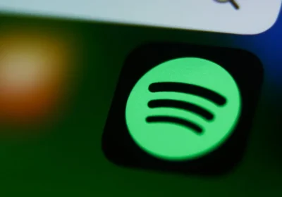
After Spotify recently introduced a glittery disco-style icon for its 20th anniversary which quickly went viral online — Google has now released its own shiny disco-themed app icons for Android Pixel users.
And honestly, reactions online are exactly what you’d expect:
some people absolutely hate them, while others strangely love them.
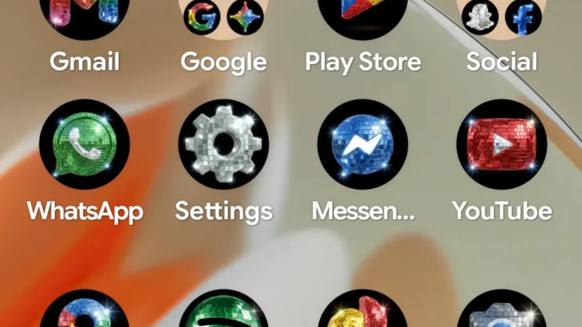
Google Turned Android Icons Into Tiny Disco Balls
The new icon pack became available for Pixel devices through Google’s newer custom icon system, which allows users to apply different visual styles to app icons using AI-generated themes.
Google’s Android ecosystem head, Sameer Samat, jokingly posted on X:
“Your wish is our command. Disco icons available on Pixel as of today … Are y’all sure you still want this?”
The screenshot shared online showed a full Android home screen covered with shiny disco-ball-inspired icons.
Honestly, it looked both terrible and weirdly entertaining at the same time.
The Internet Is Divided Over the New Look
As expected, social media users reacted immediately.
Some users called the icons:
- Ugly
- Distracting
- Overdesigned
- Hard to look at
Others thought the glittery aesthetic was:
- Funny
- Creative
- Nostalgic
- Surprisingly fun
One user joked:
“When your home screen gets bottle service.”
Another posted:
“Omg it’s awful. I’ll take it!”
And honestly, those comments perfectly summarize the internet’s reaction right now.
This Started After Spotify’s Viral Disco Icon
The trend originally exploded after Spotify temporarily changed its app icon into a shiny disco-ball version to celebrate the company’s 20th anniversary.
That redesign quickly went viral online, with many users criticizing the icon while others appreciated how ridiculous and playful it looked.
Spotify later joked:
“Alright, we know glitter is not for everyone.”
But apparently Google decided the internet needed even more glitter.
Pixel Phones Are Getting More Customization Features
The disco-ball icons are part of Google’s growing push toward customizable Android experiences on Pixel phones.
Earlier this year, Google introduced several AI-generated icon styles during its Pixel feature update, including:
- Hand-drawn “Scribbles”
- Gold-themed “Treasure”
- Artistic “Easel”
- Color-matching icon themes
Now the disco-ball style joins the collection as one of the most unusual additions so far.
Why Weird Designs Are Suddenly Popular Again
Interestingly, this playful design trend may actually reflect a larger internet culture shift happening right now.
Many younger users online are becoming more interested in:
- Nostalgic designs
- Funny aesthetics
- Playful customization
- Over-the-top visuals
Instead of perfectly clean minimalist designs, some people now prefer apps and interfaces that feel more fun and expressive.
And honestly, after years of ultra-minimal app designs, maybe a little digital chaos is starting to feel refreshing for some users.
Final Thoughts
Google’s new disco-themed Android icons are probably not going to become everyone’s favorite design choice.
But they do show how tech companies are becoming more experimental and playful with app customization in 2026.
Some users will absolutely love the glittery look.
Others will probably remove it after five minutes.
Either way, the disco-ball app icon trend has officially gone mainstream — and honestly, the internet seems to be enjoying the chaos.
🔗 Read More on VitalStack
- AI Market Growth Statistics in 2026: How Fast Is the Industry Growing?
- This Smart Desk Gadget Helped Me Fix My Posture While Working From Home
- How to Invest in Artificial Intelligence in 2026 (Beginner’s Guide to AI Stocks, ETFs & Startups)
- OpenAI Introduces ChatGPT Finance Tools That Connect to Bank Accounts
- Amazon’s New AI Shopping Assistant Powered by Alexa+
- Digital Health Trends in 2026: What’s Changing in Healthcare?
Enjoyed this article?
Subscribe for weekly deep-dives on AI and health — straight to your inbox.